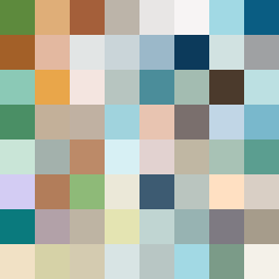
Square Project artwork
Exposure vs Shelter
safety vs exposure; pressure_vs_release; split_vertical; echo_right; braid against ripple; pressure_border; thin_vs_heavy; vessel; softness_severity | abstract variation request 368; target batch count 500
- Grid
- 8 x 8
- Cells
- 64
- Colors
- 64
- Record
- fea72fca
Artist Statement
This piece explores the tension between exposure and safety through a balanced interplay of colors and patterns. The warm brown and shelter green evoke feelings of both comfort and protection, while the pale skin and cold white colors represent vulnerability and openness. The split vertical layout symbolizes the division between these opposing emotions. The patterns of tide representing exposure blend with the framing of safety, creating a central emotional collision that resonates with the viewer. The broken pixels introduce imperfections and raw emotions, enhancing the piece's depth and complexity.