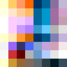
Square Project artwork
Exposure and Shelter
vulnerability vs strength; exposure_vs_shelter; rising_signal; outside_inward; flood against spark; hard_edges; thin_vs_heavy; tiny_plus; connection_alienation | abstract variation request 366; target batch count 500
- Grid
- 8 x 8
- Cells
- 64
- Colors
- 54
- Record
- fe7aa521
Artist Statement
The emotional tone reflects the juxtaposition of vulnerability and strength, captured through a palette that emphasizes warmth (yellow, orange) against cooler hues (deep blue, muted purple). The main contrast occurs between the dense cluster of strength colors on one side and the spaced, more exposed tone on the other, demonstrating the collision between safety and openness. Negative space is left to represent the tension of exposure, allowing the eye to traverse between the two emotional pulses, symbolizing both connection and alienation as they rise and fall across the composition.