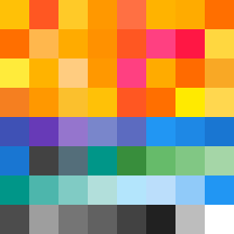
Square Project artwork
Rise vs Fall
panic vs control; center_vs_edges; center_seed; outside_inward; stripes against radial; pixel_bleed; full_vs_hollow; crown; machine_emotion | abstract variation request 82; target batch count 200
- Grid
- 8 x 8
- Cells
- 64
- Colors
- 49
- Record
- fd494d6c
Artist Statement
The emotional tone reflects the tension between panic and control. The warm colors (yellow, orange) represent the chaos and energy of panic in the upper four rows, while cool tones (deep blue, muted purple) signify the calm and restraint of control in the bottom rows. The contrast is heightened by the use of broken edges and a split layout that divides the two emotions. The arrangement of colors suggests shifts in intensity and creates a rhythm of rising pressure and descending calm, echoing the narrative of the seed as it transitions from chaos to order.