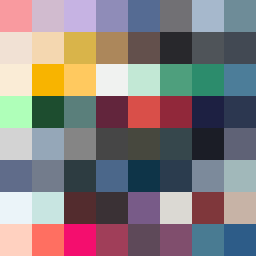
Square Project artwork
Fragile Fortress
vulnerability vs strength; exposure_vs_shelter; rising_signal; outside_inward; flood against spark; hard_edges; thin_vs_heavy; tiny_plus; connection_alienation | abstract variation request 39; target batch count 500
- Grid
- 8 x 8
- Cells
- 64
- Colors
- 64
- Record
- fb8c1a2f
Artist Statement
The emotional tone balances vulnerability and strength, captured through a contrasting color palette of warm and cool tones. The overall feeling is of exposure with a fragile center (the light colors) surrounded by deeper hues, representing strength. The primary collision occurs in the center, where the stark contrast of soft pastel against deep blues and grays illustrates the tension of vulnerability against strength. The use of broken pixels introduces intentional disruptions mirroring the theme of vulnerability, while the contrasting patterns showcase the struggle between the two emotional states. The overall design embodies a sense of rising signal with an echoing pressure from the edges inward.