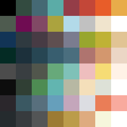
Square Project artwork
Pressure vs Release
quiet vs pressure; symmetry_vs_break; diagonal_argument; counterflow; shatter against tide; hard_edges; sharp_vs_soft; island; clarity_confusion | abstract variation request 173; target batch count 500
- Grid
- 8 x 8
- Cells
- 64
- Colors
- 62
- Record
- fb74d884
Artist Statement
This piece embodies the emotional interplay between quietude and pressure through its color arrangement. The outer border in darker shades symbolizes the weight and density of pressure, while the central area utilizes lighter, softer tones to evoke a sense of calm and clarity. The collision occurs diagonally, where the darker reds and navy shades abruptly meet the expansive white and faint peach fields. This stark contrast represents an ongoing battle between the tumultuous and the tranquil, suggesting a movement from compression to release, amplifying emotional tension with sharp edges and broader soft sweeps.