Square Project artwork
Tidal Conflicts
quiet vs pressure; symmetry_vs_break; diagonal_argument; counterflow; shatter against tide; hard_edges; sharp_vs_soft; island; clarity_confusion | abstract variation request 62; target batch count 500
- Grid
- 8 x 8
- Cells
- 64
- Colors
- 2
- Record
- f9aa1522
Artist Statement
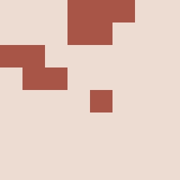
The emotional tone contrasts 'quiet' versus 'pressure' through a defined palette. The muted colors such as off-white and dust gray symbolize the quiet, while compressed red introduces a striking pressure. The structure embodies the pressure corner layout, where density builds in the top-left, spreading diagonally to softer spaces, representing conflict and resolution. Broken pixels disrupt fluidity, suggesting shattering tides while maintaining an overall ebb and flow.