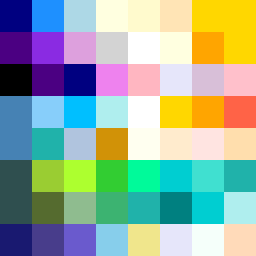
Square Project artwork
Rise vs Fall
joy vs grief; order_vs_chaos; center_seed; bottom_to_top; split_screen against rain; hard_edges; safe_vs_threatened; stair_step; machine_emotion | abstract variation request 126; target batch count 200
- Grid
- 8 x 8
- Cells
- 64
- Colors
- 49
- Record
- f958c732
Artist Statement
The emotional tone of this piece juxtaposes joy and grief, embodying a dynamic flow that rises from grief’s heavy blues to joy’s bright yellows. The palette reflects this emotional duality: deep blues symbolize grief while yellows and oranges signify joy and warmth. The contrast occurs through pixel placement, with grief dominating the lower part of the composition—depicted in deep blue and muted purple—against the brighter, warmer colors of joy occupying the upper quadrants. Hard edges separate these colors, creating a clear boundary that enhances the tension of two contrasting emotions. The stair-step rhythm of color placement steps upward to invoke joy while evoking feelings of interruption and collision with grief at the base, creating an abstract representation of life's emotional push-and-pull.