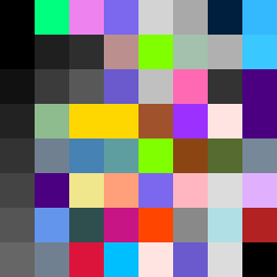
Square Project artwork
Exposed Balance
vulnerability vs strength; light_vs_weight; mirror_broken; sweep; constellation against tide; closed_corners; thin_vs_heavy; horizon; safety_exposure | abstract variation request 69; target batch count 500
- Grid
- 8 x 8
- Cells
- 64
- Colors
- 52
- Record
- f929b5ba
Artist Statement
The emotional tone of vulnerability vs strength is captured through contrasting saturated colors (like hot magenta and signal green) against muted tones (like static gray and dead black). This palette evokes the tension between lightness and weight, with the exposed center representing vulnerability under a thick edge of strength that frames it. The main collision happens in the center, where the vibrant colors interact dynamically within the subdued background, creating a pulse of energy that suggests both conflict and connection. This interplay reflects the complexities in the seed, turning the abstract qualities of 'safety' and 'exposure' into a visual confrontation.