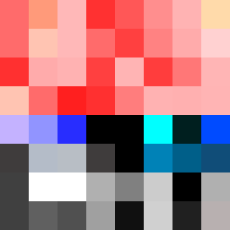
Square Project artwork
Exposure vs Shelter
vulnerability vs strength; light_vs_weight; mirror_broken; sweep; constellation against tide; closed_corners; thin_vs_heavy; horizon; safety_exposure | abstract variation request 180; target batch count 500
- Grid
- 8 x 8
- Cells
- 64
- Colors
- 47
- Record
- f8f17587
Artist Statement
The emotional tone encapsulates the tension between vulnerability and strength, expressed through a diagonal flow that divides the canvas between a dense, warm field and a softer, cooler intersecting section. The palette features warm hues like hot coral and blood orange, which evoke feelings of intensity and exposure, contrasting with the cool and muted tones of charcoal and hollow blue, representing protection and calm. The barcode pattern of strength collides with the softer stair pattern of vulnerability near the center, creating a dynamic focal point where the two emotions interact. Broken pixels are intentionally scattered to introduce imperfections, suggesting the fragility of the emotional state represented. The uneven border signifies the incomplete nature of safety and exposure, leaving space that suggests openness and the potential for intrusion or change.