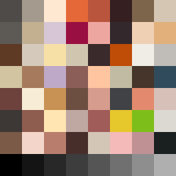
Square Project artwork
Rise vs Fall
restlessness vs peace; memory_vs_motion; diagonal_argument; edge_crawl; flame against shatter; closed_corners; light_vs_dark; patch; signal_noise | abstract variation request 418; target batch count 500
- Grid
- 8 x 8
- Cells
- 64
- Colors
- 64
- Record
- f2444325
Artist Statement
The emotional tone encapsulates a struggle between restlessness and peace. The palette—featuring stain brown, ash gray, warm ivory, soft gold, and deep wine—was selected to reflect the complexity of these emotions. Dark and muted colors suggest areas of tension and disturbance, while warm ivory and gold provide gentle accents, echoing moments of calm and clarity. The primary collision happens diagonally, where dense gray and brown colors rise while lighter tones in beige and gold cascade down. The arrangement captures the conflicting pull between memory and motion, with broken pixels representing moments of interruption. Negative spaces add breathability while still honoring the layering of emotional depth.