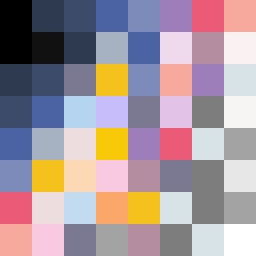
Square Project artwork
Exposure vs Shelter
vulnerability vs strength; symmetry_vs_break; cross_current; braid; flood against stack; pressure_border; fast_vs_slow; tiny_face; desire_emptiness | abstract variation request 208; target batch count 500
- Grid
- 8 x 8
- Cells
- 64
- Colors
- 30
- Record
- f14fdb2e
Artist Statement
This composition captures the tension between vulnerability and strength through dense, saturated colors in the center contrasting against lighter, more fragile tones along the edges. The palette balances electric blue and hot magenta as bold accents against the static gray and dead black, symbolizing strength and shelter. The main contrast occurs in the center where the tide pattern (representing strength) meets the flood pattern (representing vulnerability), reflecting emotional collisions. The central area is full, evoking an overwhelming feeling, while broken pixels introduce purposeful intricacies, echoing imperfections and scars. The design conveys the complex interplay of protection and exposure, where color placement signifies emotional weight and texture around a vulnerable core made stronger by the interaction.