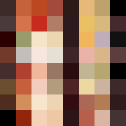
Square Project artwork
Exposure vs Shelter
vulnerability vs strength; light_vs_weight; mirror_broken; sweep; constellation against tide; closed_corners; thin_vs_heavy; horizon; safety_exposure | abstract variation request 499; target batch count 500
- Grid
- 8 x 8
- Cells
- 64
- Colors
- 62
- Record
- f08a550f
Artist Statement
The piece captures the emotional tension between vulnerability and strength. The palette of burnt orange and dark red evokes warmth and intensity, representing strength, while the charcoal shadows suggest vulnerability and unpredictability. There is a clear contrast between the dense, strong colors at the edges (dark colors forming a protective frame) and the lighter, exposed center suggesting fragility. The main collision occurs diagonally from the corner, with strength pushing against vulnerability, creating a sense of dynamic pressure while maintaining negative space for balance. This abstract pattern allows for both protection and exposure, reflecting the seed's themes.