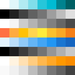
Square Project artwork
Exposure vs Shelter
vulnerability vs strength; light_vs_weight; mirror_broken; sweep; constellation against tide; closed_corners; thin_vs_heavy; horizon; safety_exposure | abstract variation request 77; target batch count 500
- Grid
- 8 x 8
- Cells
- 64
- Colors
- 55
- Record
- ef321eff
Artist Statement
This artwork conveys the emotional tone of tension between vulnerability and strength, using a palette that balances clarity and confusion. The colors, primarily clean white and ice blue with accents of ink black and warning orange, create a contrast where the pale exposed center symbolizes vulnerability, while the darker shades suggest strength encroaching. The main collision occurs in the center, where the blue meets the black, representing the push and pull of these conflicting emotions. Broken pixels interrupt the orderly flow, enhancing the idea of a mirror broken—perfectly imperfect. The layout creates a mirrored effect but purposefully disturbs it with mismatched colors, reinforcing the conceptual fractures embodied in the seed.