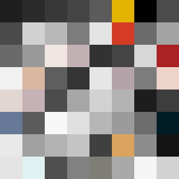
Square Project artwork
Pressure Point
quiet vs pressure; symmetry_vs_break; diagonal_argument; counterflow; shatter against tide; hard_edges; sharp_vs_soft; island; clarity_confusion | abstract variation request 137; target batch count 500
- Grid
- 8 x 8
- Cells
- 64
- Colors
- 60
- Record
- ee03a9d3
Artist Statement
This artwork explores the emotional dichotomy of quiet versus pressure through a carefully chosen color palette that includes subdued off-white and dust gray, juxtaposed against more vivid shades like compressed red and dark navy. The top left corner is densely filled, symbolizing pressure, while the bottom right subtly releases into softer hues, representing quiet. The main collision occurs along a diagonal axis, where the darker tones clash with the lighter accents, suggesting a shattering against an underlying calmness. This arrangement reflects the tension and release articulated in the seed.