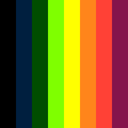
Square Project artwork
Exposure vs Shelter
vulnerability vs strength; symmetry_vs_break; cross_current; braid; flood against stack; pressure_border; fast_vs_slow; tiny_face; desire_emptiness | abstract variation request 343; target batch count 500
- Grid
- 8 x 8
- Cells
- 64
- Colors
- 8
- Record
- ec95413e
Artist Statement
The emotional tone explores the juxtaposition of vulnerability and strength, with a predominantly dark palette accented by lighter hues to illustrate contrasts between tension and release. The colors chosen reflect a sense of awe and terror, creating a dynamic interplay between a dense foundation of dark tones and lighter, more fragile accents. The main collision occurs centrally, where softer pastels interrupt the darker, more structured areas, suggesting moments of exposure amidst a protective framework. This layout embodies the spiral pressure, drawing the viewer's eye toward a faint point of vulnerability at the center, thereby reinforcing the theme of strength in the face of fragility.