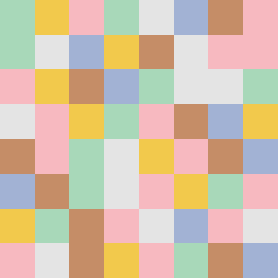
Square Project artwork
Exposure vs Shelter
vulnerability vs strength; symmetry_vs_break; cross_current; braid; flood against stack; pressure_border; fast_vs_slow; tiny_face; desire_emptiness | abstract variation request 77; target batch count 500
- Grid
- 8 x 8
- Cells
- 64
- Colors
- 6
- Record
- ec18ae0e
Artist Statement
The emotional tone emphasizes the contrast between vulnerability's pale openness and strength's dense structure. The palette combines muted colors of shelter green and warm brown to suggest safety, clashing with cold white for exposed areas and open blue to symbolize desire. The main contrast resides on the diagonal, where rings of pale skin and cold white collide with braids of shelter green and warm brown, creating an interplay of hard versus soft. Broken pixels introduce an intentional disruption to emphasize imperfection and tension, reflecting the complex dynamics of protecting and exposing oneself.