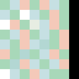
Square Project artwork
Erosion of Shelter
safety vs exposure; pressure_vs_release; split_vertical; echo_right; braid against ripple; pressure_border; thin_vs_heavy; vessel; softness_severity | abstract variation request 335; target batch count 500
- Grid
- 8 x 8
- Cells
- 64
- Colors
- 7
- Record
- ea5a9416
Artist Statement
This piece embodies the emotional tension between vulnerability and protection. The palette, featuring 'shelter_green' and 'cold_white', reflects both tranquility and tension. The dominant cool colors represent exposure, while warmer hues in the border provide a sense of safety. The central collision of pale tones echoes vulnerability, contrasting sharply with the darker edges that feel like a protective barrier. The design mimics a split vertical flow, accentuating the push and pull between safety and exposure, creating a dynamic rhythm through contrasting patterns.