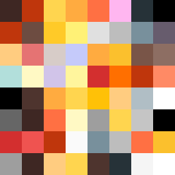
Square Project artwork
Tidal Balance
vulnerability vs strength; light_vs_weight; mirror_broken; sweep; constellation against tide; closed_corners; thin_vs_heavy; horizon; safety_exposure | abstract variation request 51; target batch count 500
- Grid
- 8 x 8
- Cells
- 64
- Colors
- 39
- Record
- ea1e5a95
Artist Statement
This piece conveys the emotional tension between vulnerability and strength through its color choices and abstract arrangements. The palette of burnt orange and dark red reflects the intensity of strength, while the use of charcoal and gold introduces a softer, vulnerable aspect. The jagged edges symbolize the unpredictable boundaries of safety and exposure, embodying both the protected inner core and the exposed outer frame. The collision lies in the center, where the strong stripes clash against the delicate stair patterns, creating a dynamic interplay that suggests both conflict and harmony amidst chaos.