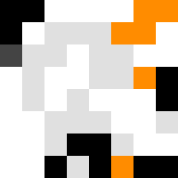
Square Project artwork
Eroded Strength
vulnerability vs strength; exposure_vs_shelter; rising_signal; outside_inward; flood against spark; hard_edges; thin_vs_heavy; tiny_plus; connection_alienation | abstract variation request 214; target batch count 500
- Grid
- 8 x 8
- Cells
- 64
- Colors
- 5
- Record
- e99313e1
Artist Statement
The emotional tone captures a tension between vulnerability and strength, symbolized by the interplay of soft and hard edges. The color palette of clean white and ink black conveys clarity and confusion, creating a dynamic contrast. The use of icy blue and warning orange introduces emotional sparks against a backdrop of gray, representing the necessity and risk of exposure. The central collision occurs between the dense black and vibrant orange, representing the struggle of rising signals against hard edges, with broken pixels creating intentional disruptions around the edges, amplifying the process of eroding symmetry while retaining a focal point.