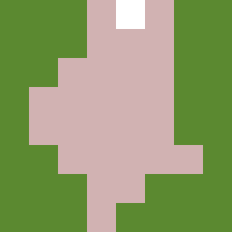
Square Project artwork
Exposed Boundaries
safety vs exposure; pressure_vs_release; split_vertical; echo_right; braid against ripple; pressure_border; thin_vs_heavy; vessel; softness_severity | abstract variation request 260; target batch count 500
- Grid
- 8 x 8
- Cells
- 64
- Colors
- 3
- Record
- e9841fe6
Artist Statement
This artwork embodies the tension between the concepts of safety and exposure. The color palette of soft greens and warm browns symbolizes safety, while pale skin tones and cold whites illustrate exposure. The arrangement features heavy ripples on one side, which represent safety’s comforting presence, contrasting with brighter, dot-like echoes on the other side, suggesting vulnerability. This clash of patterns not only plays out visually but also narrates an emotional battle between feeling protected and open. The dominant presence of warm brown contrasts with the unprotected whites, creating a dynamic interplay visualizing a push and pull, akin to the feelings of confronting one’s vulnerabilities.