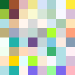
Square Project artwork
Exposure and Shelter's Embrace
safety vs exposure; pressure_vs_release; split_vertical; echo_right; braid against ripple; pressure_border; thin_vs_heavy; vessel; softness_severity | abstract variation request 248; target batch count 500
- Grid
- 8 x 8
- Cells
- 64
- Colors
- 51
- Record
- e724eed5
Artist Statement
The emotional tone captures the tension between safety and vulnerability, as seen in the chosen color palette of shelter green, warm brown, pale skin, cold white, and open blue. The darker shelter colors form a protective border, while the lighter tones pulse in the center, echoing feelings of exposure. The collision happens predominantly in the center, where tightly clustered light colors contrast sharply with the surrounding stabilizing darker shades, symbolizing the delicate balance between pressure and release. The patterns of stack and thread intersect, creating a dynamic interplay that emphasizes the layered complexities of emotion derived from the seed.