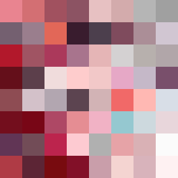
Square Project artwork
Exposure vs Shelter
vulnerability vs strength; symmetry_vs_break; cross_current; braid; flood against stack; pressure_border; fast_vs_slow; tiny_face; desire_emptiness | abstract variation request 112; target batch count 500
- Grid
- 8 x 8
- Cells
- 64
- Colors
- 64
- Record
- e539b896
Artist Statement
This composition explores the tension between vulnerability and strength through a delicate arrangement of color and pattern. The palette, which includes shades of pink, red, gray, and dark maroon, encapsulates both warmth and depth, symbolizing emotional contrasts. The soft glows of pinks and reds represent vulnerability, while the deeper, shadowy gray and maroon suggest strength. The arrangement emphasizes an off-center dominant color (maroon), which symbolizes strength, while broken dots represent moments of vulnerability. There is a clear collision of soft, warm hues against muted shadows, creating a narrative of exposure, protection, and balance within the constraints of negative space. The use of broken pixels adds intentional disruption, mirroring the imperfections of emotional experiences, particularly around the edges, reinforcing the theme of shelter against external pressures while still allowing glimpses of open vulnerability.