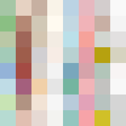
Square Project artwork
Exposure vs Shelter
safety vs exposure; pressure_vs_release; split_vertical; echo_right; braid against ripple; pressure_border; thin_vs_heavy; vessel; softness_severity | abstract variation request 474; target batch count 500
- Grid
- 8 x 8
- Cells
- 64
- Colors
- 64
- Record
- e425a2df
Artist Statement
This composition embodies the dichotomy of safety and exposure through a delicate balance of muted and vibrant colors. The palette, featuring shelter green and open blue, suggests a theme of refuge contrasted with vulnerability. The emotional intensity is derived from the playful tension between the vibrant colors at the center and the muted edges. The central focus, emulating warmth against the coolness of exposure, creates a rhythmic flow of colors reminiscent of waves. The layout suggests upward movement, representing hope, while the broken pixels introduce a raw, human touch, accentuating the themes of softness and severity.