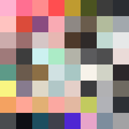
Square Project artwork
Contrasting Ascent
nostalgia vs progress; rise_vs_fall; split_horizontal; drip; target against grid; bottom_weighted; full_vs_hollow; window; rage_calm | abstract variation request 127; target batch count 200
- Grid
- 8 x 8
- Cells
- 64
- Colors
- 64
- Record
- e18c5ba0
Artist Statement
The emotional tone reflects the tension between nostalgia and progress. The palette, embodying shades of pink, gray, and dark maroon, conveys warmth and heaviness, while maintaining a sense of balance. The dramatic split creates a horizontal contrast where the upper half suggests upward trends (progress) with dynamic bursts of color, while the lower half evokes a sense of grounding and heaviness (nostalgia) with darker, more muted tones. The arrangement of colors forms a scenario of tension where the vibrant hues drip downwards, symbolizing a pull towards the past that struggles against the pull of the future.