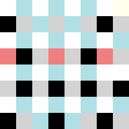
Square Project artwork
Exposure vs Shelter
vulnerability vs strength; symmetry_vs_break; cross_current; braid; flood against stack; pressure_border; fast_vs_slow; tiny_face; desire_emptiness | abstract variation request 316; target batch count 500
- Grid
- 8 x 8
- Cells
- 64
- Colors
- 6
- Record
- e0dca5df
Artist Statement
This composition embodies the emotional tug-of-war between vulnerability and strength. The chosen palette of clean white, ice blue, and ink black represents the struggle—a stark contrast of lightness and depth, reflecting moments of exposure versus protection. The dominant presence of ice blue suggests a calming strength, with black providing a striking backdrop that defines the boundaries while white areas represent vulnerability. The collision occurs centrally, where radial and tide patterns intersect, creating an intentional chaos around a hollow space. This mirrors the emotional journey from safety to exposure, illustrating the dynamic interplay of strength and vulnerability in a visceral abstract form.