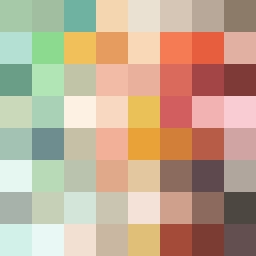
Square Project artwork
Exposure vs Shelter
safety vs exposure; pressure_vs_release; split_vertical; echo_right; braid against ripple; pressure_border; thin_vs_heavy; vessel; softness_severity | abstract variation request 374; target batch count 500
- Grid
- 8 x 8
- Cells
- 64
- Colors
- 64
- Record
- e0ae04ef
Artist Statement
This composition captures the emotional struggle between the forces of safety and exposure. The palette features soft yet contrasting colors—gentle shelter greens and warm browns embrace a central pale skin color to symbolize safety. The darker edges mirror the pressure of exposure, while lighter hues cascade toward the center, introducing the idea of release. The ladder pattern represents exposure's rhythm, whereas the target pattern provides a secure backdrop, allowing one to echo into the other. The main collision occurs at the center, creating a spiral of tension and relief that illustrates the complex interplay of these contrasting emotions.