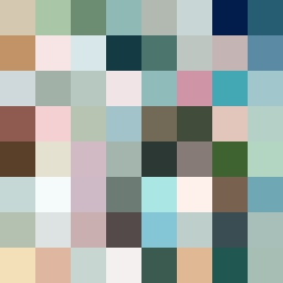
Square Project artwork
Exposure vs Shelter
safety vs exposure; pressure_vs_release; split_vertical; echo_right; braid against ripple; pressure_border; thin_vs_heavy; vessel; softness_severity | abstract variation request 358; target batch count 500
- Grid
- 8 x 8
- Cells
- 64
- Colors
- 64
- Record
- de449ed9
Artist Statement
The artwork captures the emotional dichotomy between safety and exposure. A palette derived from calm shelter greens and warm browns is juxtaposed against the coolness of open blues and pale skin tones to create tension. The left and right sides mirror each other, yet minor disruptions in color create a sense of imperfection, symbolizing the struggle between protection and vulnerability. The central collision of softer and harsher colors illustrates the tension between safety (grounding browns) and exposure (glitchy blues).