Square Project artwork
Pressure vs Release
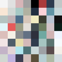
quiet vs pressure; symmetry_vs_break; diagonal_argument; counterflow; shatter against tide; hard_edges; sharp_vs_soft; island; clarity_confusion | abstract variation request 153; target batch count 500
- Grid
- 8 x 8
- Cells
- 64
- Colors
- 64
- Record
- ddfbb9ca
Artist Statement
This composition exhibits the emotional tension between 'quiet' and 'pressure' through contrasting color placements and textures. The selected palette of muted tones like 'off_white' and 'dust_gray' represent softness, while 'compressed_red' and 'dark_navy' introduce a sense of density and weight. The main collision occurs towards the center, where the bold colors intersect with the quieter spaces, creating a dynamic pattern reminiscent of breaking waves meeting a calm shore. The diagonal flow captures the interruption of tranquility by pressure, with the mirrored layout hinting at symmetry disrupted by one or two broken pixels, creating a sense of intentional imperfection and emotional depth.