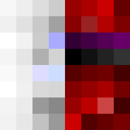
Square Project artwork
Pressure vs Release
quiet vs pressure; symmetry_vs_break; diagonal_argument; counterflow; shatter against tide; hard_edges; sharp_vs_soft; island; clarity_confusion | abstract variation request 133; target batch count 500
- Grid
- 8 x 8
- Cells
- 64
- Colors
- 55
- Record
- dd31e5af
Artist Statement
This artwork explores the juxtaposition of emotions defined by quiet and pressure. The left side utilizes muted tones of off-white and faint peach, symbolizing tranquility and stillness, while the right side employs darker colors like compressed red and dark navy to represent tension and compression. The visual arrangement creates a sense of density on the pressure side, with broken pixels interrupting seamless transitions to signify cracks in pressure. The stylistic edge enhances the sharp vs. soft dynamic, granting clarity from confusion. The main contrast occurs along the vertical split, focusing on the emotional battle between calm and intensity, captured in an abstract form devoid of literal imagery.