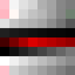
Square Project artwork
Exposure vs Shelter
vulnerability vs strength; light_vs_weight; mirror_broken; sweep; constellation against tide; closed_corners; thin_vs_heavy; horizon; safety_exposure | abstract variation request 55; target batch count 500
- Grid
- 8 x 8
- Cells
- 64
- Colors
- 61
- Record
- dc4c51b5
Artist Statement
This artwork embodies the emotional tension between vulnerability and strength by creating a split composition. The left side uses soft, muted colors to signify vulnerability, while the right side employs stronger, more defined colors to represent strength. The contrast occurs along the vertical divide, symbolizing a horizon where exposure meets safety. The palette—featuring delicate powder pinks, warm whites against the severity of carbon black and sharp crimson—further enhances this duality. The choice of patterns, with stripes on the 'strength' side and a grid on the 'vulnerability' side, encounters in the center, reflecting the interplay between these opposing emotions. Broken pixels introduce imperfections, embodying the unpredictable nature of safety and exposure.