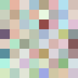
Square Project artwork
Exposure vs Shelter
vulnerability vs strength; light_vs_weight; mirror_broken; sweep; constellation against tide; closed_corners; thin_vs_heavy; horizon; safety_exposure | abstract variation request 355; target batch count 500
- Grid
- 8 x 8
- Cells
- 64
- Colors
- 64
- Record
- dbe28377
Artist Statement
The emotional tone balances vulnerability and strength, leveraging a palette that contrasts warm browns and greens for safety with pale blues and whites for exposure. The center features lighter hues suggesting vulnerability, while the edges use dense, earthy colors for a grounding strength. The play between the contrasting patterns of the glitch and braid reflects the struggle for control, with a collision at the grid’s center, creating tension and a narrative of conflict.