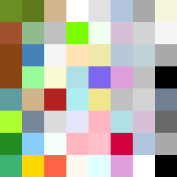
Square Project artwork
Contrast of Shelter and Exposure
safety vs exposure; pressure_vs_release; split_vertical; echo_right; braid against ripple; pressure_border; thin_vs_heavy; vessel; softness_severity | abstract variation request 299; target batch count 500
- Grid
- 8 x 8
- Cells
- 64
- Colors
- 50
- Record
- db6955c3
Artist Statement
The emotional tone here reflects the tension between safety and exposure, focusing on a fragile center contrasted by a protective border. The color palette combines soft greens and browns to suggest safety, while pale and cold colors express vulnerability. The flowing rhythm from left to right introduces a dynamic interaction between broken dots representing exposure and a patchwork indicating safety. The collision happens vertically, creating a stark division while still allowing for overlaps that suggest a complex narrative of balance and tension.