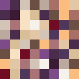
Square Project artwork
Exposure vs Shelter
vulnerability vs strength; light_vs_weight; mirror_broken; sweep; constellation against tide; closed_corners; thin_vs_heavy; horizon; safety_exposure | abstract variation request 22; target batch count 500
- Grid
- 8 x 8
- Cells
- 64
- Colors
- 15
- Record
- db6597e2
Artist Statement
This composition reflects the emotional tension between vulnerability and strength through a contrasting palette of muted cream and dark plum with energetic accents of small orange. The top left is dense with deep colors suggesting strength, anchoring the square, while the pale center signifies vulnerability, leaving it exposed to incoming flows of color. The collision happens where the orange interrupts the muted tones, representing the struggle between safety and exposure. Broken pixels are used to create intentional disruptions, enhancing the feeling of fracture and imperfection, much like the emotional state it embodies.