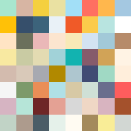
Square Project artwork
Exposure and Shelter
safety vs exposure; pressure_vs_release; split_vertical; echo_right; braid against ripple; pressure_border; thin_vs_heavy; vessel; softness_severity | abstract variation request 421; target batch count 500
- Grid
- 8 x 8
- Cells
- 64
- Colors
- 64
- Record
- da520266
Artist Statement
This artwork delves into the emotional dichotomy of safety versus exposure through its color choices and arrangement. The soft greens and warm browns evoke a sense of protection and stability, representing 'safety.' In contrast, the pale skin tones and cold whites signify vulnerability, portraying 'exposure.' The central area features a lattice pattern intertwined with pulse marks, symbolizing the tension between the two themes. The collision takes place vertically along the center, where warmth and coolness meet, creating a dynamic interplay of pressure and release. Broken pixels are intentionally scattered to signify disruptions, adding complexity and depth to the narrative. Negative spaces are carefully placed, allowing both themes to breathe, which contributes to an overall wage of emotional tension and calm.