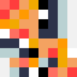
Square Project artwork
Exposure vs Shelter
vulnerability vs strength; light_vs_weight; mirror_broken; sweep; constellation against tide; closed_corners; thin_vs_heavy; horizon; safety_exposure | abstract variation request 299; target batch count 500
- Grid
- 8 x 8
- Cells
- 64
- Colors
- 11
- Record
- d916012c
Artist Statement
This composition balances the emotional tones of vulnerability and strength through a carefully chosen palette that conveys warmth and coolness. The contrast between the subdued hues of hollow blue and the vibrant shades of hot coral and blood orange represents the tension between safety and exposure. The main collision occurs in the center, where brighter colors punctuate the softer tones, suggesting interrupted continuity and the fragility of strength. The scattered repair layout forms a sense of brokenness—a reflection of the mirror concept—while maintaining an open area for contemplation, drawing from the seed's essence.