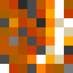
Square Project artwork
Contrast of Memories
nostalgia vs progress; rise_vs_fall; split_horizontal; drip; target against grid; bottom_weighted; full_vs_hollow; window; rage_calm | abstract variation request 82; target batch count 200
- Grid
- 8 x 8
- Cells
- 64
- Colors
- 13
- Record
- d837e2d0
Artist Statement
The emotional tone plays on the tension between nostalgia and progress. The palette of burnt orange and dark red highlights warm, comforting tones reflecting nostalgia, while the charcoal and gold introduce elements of starkness and hope signifying progress. The contrast comes from a split layout where the upper half is densely packed with darker shades, suggesting heavier emotional weight, while the lower half bursts with lighter tones, presenting a release and progression towards brightness. The design reflects a battle between the deep, rich memories and the sharp, clear advancements, allowing for movement from the center outward.