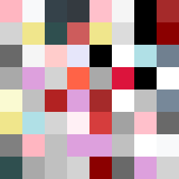
Square Project artwork
Quiet Collision
softness vs severity; signal_vs_noise; open_gate; spiral_counterclockwise; pulse_marks against radial; bottom_weighted; light_vs_dark; tiny_plus; guilt_forgiveness | abstract variation request 91; target batch count 500
- Grid
- 8 x 8
- Cells
- 64
- Colors
- 33
- Record
- d6d56dbd
Artist Statement
This piece explores the emotional contrast between softness and severity through a palette that balances warm and cool tones. The colors—a blend of powder pink, warm white for softness and carbon black, steel gray, sharp crimson for severity—create a visual tug-of-war. Each color is arranged to reflect a pulse against a radial quiet field, embodying a sense of emerging from a dark hoard (severity) into lightness (softness). The center holds a collision of colored ‘pulse marks’ surrounded by a boundary that feels restrictive, yet intentionally broken, suggesting openings to forgiveness against the weight of guilt.