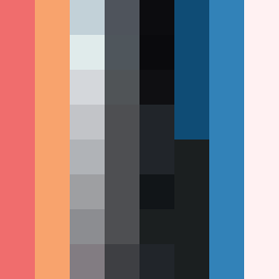
Square Project artwork
Fractured Harmony
vulnerability vs strength; exposure_vs_shelter; rising_signal; outside_inward; flood against spark; hard_edges; thin_vs_heavy; tiny_plus; connection_alienation | abstract variation request 216; target batch count 500
- Grid
- 8 x 8
- Cells
- 64
- Colors
- 24
- Record
- d4406444
Artist Statement
The emotional tone of this piece captures the tension between vulnerability and strength through a range of colors that ebb and flow across the square. The color palette combines warm coral and soft amber to represent light and vulnerability, contrasted against the deep blue-black and cold slate symbolizing strength and grounding. The primary collision occurs in the center, where the glitch patterns of strength disrupt the ladder-like patterns of vulnerability, creating a visually engaging conversation. The negative space complements this dynamic, emphasizing the open environment and allowing the contrast to breathe, echoing the themes of exposure and shelter.