Square Project artwork
Pressure vs Release
quiet vs pressure; symmetry_vs_break; diagonal_argument; counterflow; shatter against tide; hard_edges; sharp_vs_soft; island; clarity_confusion | abstract variation request 22; target batch count 500
- Grid
- 8 x 8
- Cells
- 64
- Colors
- 4
- Record
- d42ddc91
Artist Statement
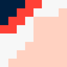
This artwork embodies the emotional contrast between pressure and quiet through strategic placement of colors. The dense dark navy (#001F3F) anchors one diagonal wedge, representing pressure, while the soft faint peach (#FFD1C1) occupies the opposite wedge, suggesting quiet release. The crack pattern of compressed red (#FF4136) fractures the calm areas, enhancing the tension of feelings colliding. The off-white (#F7F7F7) acts as a halo that balances the heaviness of the darker colors, maintaining clarity in a confusing landscape. Broken pixels introduce imperfections that reflect the chaos amidst the calm, creating an abstract narrative of tension between the two emotions, as guided by the seed’s themes.