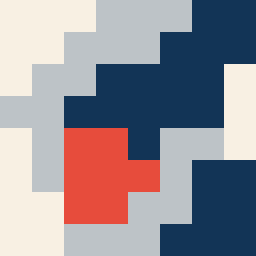
Square Project artwork
Exposure vs. Shelter
vulnerability vs strength; symmetry_vs_break; cross_current; braid; flood against stack; pressure_border; fast_vs_slow; tiny_face; desire_emptiness | abstract variation request 153; target batch count 500
- Grid
- 8 x 8
- Cells
- 64
- Colors
- 4
- Record
- d389e0aa
Artist Statement
The emotional tone reflects a tension between vulnerability and strength, utilizing a contrast of color dynamics. The chosen palette, 'quiet_pressure', serves to underscore this duality—lighter tones signify vulnerability, while deeper hues stand for strength. The layout emphasizes a dense island of activity in the center, surrounded by a calmer sea of colors, embodying the push and pull between exposure and protection. The primary collision occurs centrally where the radial pattern of vulnerability meets the crack-like formations of strength, echoing the interplay of these emotions.