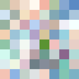
Square Project artwork
Exposure vs Shelter
vulnerability vs strength; light_vs_weight; mirror_broken; sweep; constellation against tide; closed_corners; thin_vs_heavy; horizon; safety_exposure | abstract variation request 9; target batch count 500
- Grid
- 8 x 8
- Cells
- 64
- Colors
- 64
- Record
- d368d8ee
Artist Statement
The emotional tone captures the delicate interplay between vulnerability and strength. The palette consists of soft and warm colors (pale_skin, cold_white, and shelter_green) contrasting with deeper shades (warm_brown, open_blue), evoking a sense of safety intertwined with exposure. The core center is saturated with vibrant hues, reflecting strength, while thin borders of pale colors embody vulnerability, creating tension. The main contrast occurs where the vibrant contrast meets the softer edges, emphasizing a collision of sensations that mirrors the themes of tension and protection. The 'door' metaphor suggests an entryway to vulnerabilities and strengths alike, creating an abstract spatial narrative within the grid.