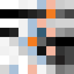
Square Project artwork
Exposure vs Shelter
vulnerability vs strength; symmetry_vs_break; cross_current; braid; flood against stack; pressure_border; fast_vs_slow; tiny_face; desire_emptiness | abstract variation request 326; target batch count 500
- Grid
- 8 x 8
- Cells
- 64
- Colors
- 22
- Record
- d04f48f9
Artist Statement
The emotional tone explores the tension between vulnerability and strength through a carefully chosen palette and an unbalanced distribution of colors. The stark contrast of clean white and ink black represents strength and vulnerability respectively, creating a visual push-and-pull in the composition. The main collision occurs in the center, echoing the exposed core concept from the seed, while halos of calming colors like ice blue wrap around, suggesting shelter. Strong accents of warning orange break the pattern, representing the chaotic forces of change and the weight of desire and emptiness. The layout and patterns intend to evoke feelings of tension and release, achieved by careful placement of broken pixels to simulate scars or marks of past experiences.