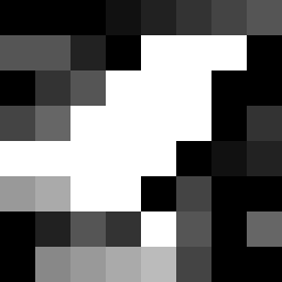
Square Project artwork
Exposure vs Shelter
vulnerability vs strength; light_vs_weight; mirror_broken; sweep; constellation against tide; closed_corners; thin_vs_heavy; horizon; safety_exposure | abstract variation request 340; target batch count 500
- Grid
- 8 x 8
- Cells
- 64
- Colors
- 13
- Record
- ceb7bd2d
Artist Statement
The emotional tone reflects a struggle between vulnerability and strength, represented by a pale aqua core surrounded by the contrasting stability of ink blue. The color palette emphasizes serenity and urgency, using pale aqua and mist gray for softness, while alarm red introduces intense bursts of emotion. The outer edge in a barcode pattern showcases strength with dense ink blue contrasting against an exposed, lighter inner square (4x4) filled with an ash field motif that hints at fragility and quiet. The significant collision occurs centrally where patterns meeting create a sense of tension and balance, while broken pixels disrupt the flow, symbolizing imperfections and moments of vulnerability.