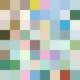
Square Project artwork
Exposure vs Shelter
safety vs exposure; pressure_vs_release; split_vertical; echo_right; braid against ripple; pressure_border; thin_vs_heavy; vessel; softness_severity | abstract variation request 465; target batch count 500
- Grid
- 8 x 8
- Cells
- 64
- Colors
- 64
- Record
- cd570f3b
Artist Statement
This artwork explores the emotional tension between safety and exposure. The left side utilizes a patterned checker of warm browns representing shelter, crystallizing feelings of protection, while the right side employs a target-like arrangement of cooler colors, suggesting the open vulnerability of exposure. The overall palette of shelter green, warm brown, pale skin, cold white, and open blue enhances the contrast between warmth and coolness. The primary collision occurs at the vertical center, where the two emotions overlap and engage in a visual interplay of soft backgrounds and defined edges, embodying the braiding against ripple conceptual flow drawn from the seed's essence.