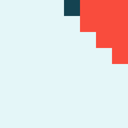
Square Project artwork
Exposure vs Shelter
vulnerability vs strength; symmetry_vs_break; cross_current; braid; flood against stack; pressure_border; fast_vs_slow; tiny_face; desire_emptiness | abstract variation request 61; target batch count 500
- Grid
- 8 x 8
- Cells
- 64
- Colors
- 3
- Record
- cd3eb47b
Artist Statement
The emotional tone contrasts vulnerability and strength through a gentle gradient of colors. The selected palette of pale aqua and alarm red represents the delicate balance of exposure and protection, using clear white as a quiet field and mist gray to suggest softness. The main collision unfolds diagonally, where the strength emerges as dense blocks of color that shelter the exposed areas, echoing a braid's complexity through interwoven patterns of vulnerability. Broken pixels are strategically used to symbolize imperfections and breaks in the structure, enhancing the overall tension within the composition.