Square Project artwork
Exposure vs Shelter
vulnerability vs strength; symmetry_vs_break; cross_current; braid; flood against stack; pressure_border; fast_vs_slow; tiny_face; desire_emptiness | abstract variation request 151; target batch count 500
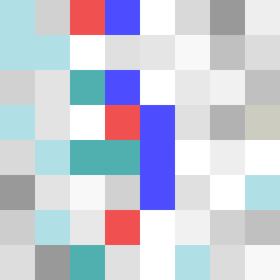
- Grid
- 8 x 8
- Cells
- 64
- Colors
- 21
- Record
- ca5a5d36
Artist Statement
The emotional tone of this square contrasts vulnerability with strength, creating a visual dialogue between softness and density. The chosen palette of pale aqua, mist gray, alarm red, ink blue, and clear white underscores this tension—pale aqua and mist gray suggest vulnerability and a delicate heart, while alarm red and ink blue provide contrast and a sense of urgency and strength. The layout features a diagonal argument, where serene colors form a soft corner while more dynamic hues create a dense cluster on the opposite edge, symbolizing the conflict and interdependence of the two emotions. The intentional placement of broken pixels throughout adds imperfections, representing the scars and interruptions of strength amid vulnerability, while maintaining clear negative space to evoke feelings of emptiness and desire.