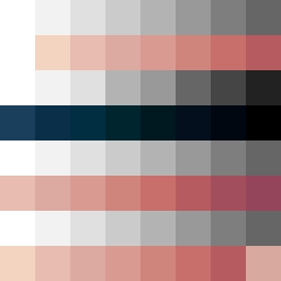
Square Project artwork
Tides of Contrast
certainty vs curiosity; order_vs_chaos; rising_signal; bottom_to_top; tide against channels; receding_edges; straight_vs_curved; cage; relief_dread | abstract variation request 61; target batch count 200
- Grid
- 8 x 8
- Cells
- 64
- Colors
- 28
- Record
- c9e53cfd
Artist Statement
The emotional tone reflects a struggle between certainty and curiosity, embodied in the dichotomy of stacked, orderly patterns clashing with broken dots that suggest questions and uncertainty. The calm color palette of off-white and faint peach represents a sense of clarity and relief, while the deeper navy and compressed red colors create tension and evoke a sense of chaos just beneath the surface. The main collision occurs centrally, where orderly stacked patterns break into a more chaotic configuration, symbolizing the tension of rising signals against established boundaries. This layout presents the idea of a protective center surrounded by the chaotic exploration typical of curiosity, creating a striking contrast that speaks to inner conflict.