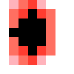
Square Project artwork
Order vs Chaos
softness vs severity; signal_vs_noise; open_gate; spiral_counterclockwise; pulse_marks against radial; bottom_weighted; light_vs_dark; tiny_plus; guilt_forgiveness | abstract variation request 506; target batch count 500
- Grid
- 8 x 8
- Cells
- 64
- Colors
- 5
- Record
- c9baef78
Artist Statement
This piece explores the juxtaposition of softness and severity through a calculated yet chaotic arrangement. The palette incorporates soft tones of powder pink and warm white alongside the stark contrast of carbon black and sharp crimson, illustrating the tension between light and dark. The center is dense with a shatter-like pattern, mimicking emotional interruption, while the outer edges reflect the tide pattern, embodying a sense of order and limitation. The design emphasizes the collision in the center, where intensity and disruption coalesce, resulting in a pulse-like rhythm across the grid.