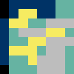
Square Project artwork
Exposed Safety
vulnerability vs strength; light_vs_weight; mirror_broken; sweep; constellation against tide; closed_corners; thin_vs_heavy; horizon; safety_exposure | abstract variation request 311; target batch count 500
- Grid
- 8 x 8
- Cells
- 64
- Colors
- 5
- Record
- c7ebe4c0
Artist Statement
This artwork reflects the emotional tug-of-war between vulnerability and strength. The chosen palette of mourning black (#000000), deep blue (#003366), new leaf green (#66B3A2), pale yellow (#F6EB61), and stone gray (#BDBDBD) illustrates the interplay between dark, stable colors representing strength and soft, light hues symbolizing vulnerability. The dense core of deep blue serves as a stable center, while the surrounding layers of pale yellow and green exhibit fragility. The main collision occurs at the center, where the deep blue and pale yellow collide, representing the tension of exposure versus shelter. Broken pixels in the piece introduce intentional design imperfections, evoking the unpredictability and imperfections of emotional experiences.