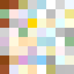
Square Project artwork
Erosion of Shelter
safety vs exposure; pressure_vs_release; split_vertical; echo_right; braid against ripple; pressure_border; thin_vs_heavy; vessel; softness_severity | abstract variation request 176; target batch count 500
- Grid
- 8 x 8
- Cells
- 64
- Colors
- 37
- Record
- c5cb53da
Artist Statement
The emotional tone presents a stark contrast between vulnerability and protection. The warm brown and shelter green evoke a sense of safety, while the pale skin and open blue suggest exposure. This duality is reflected through a split vertical layout, where one side is denser and more structured, embodying safety, and the other fades into softer, quieter islands of color representing vulnerability. The broken pixels add a sense of imperfection and interruption, enhancing the feeling of a fragile balance between shelter and exposure.